If you need help with the guidelines, just give us a call and one of our friendly team experts will guide you through it.
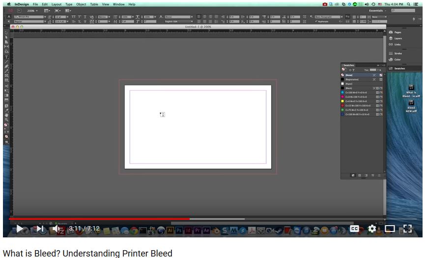
Also here is a video that is very helpful in understanding what we need. Please click image below to watch the video.
BOOKLETS - IMPORTANT: For booklets we do not want a file in spreads (reader spread or printer spread). Please send a single high resolution PDF file with individual pages.
For a 16 page booklet for example you would send a PDF file with 16 pages in it. Not 8.
To make your artwork "a print ready" follow the instructions below to ensure it meets the following requirements.
FILE FORMAT - We strongly prefer PDF files over any other format.
PDF creation tools are available that will allow you to make a PDF from the most commonly used programs. A free software for converting files to PDF, including Primo PDF and CutePDF can be used to convert your files before uploading them to our website.
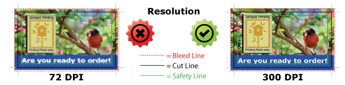
RESOLUTION - To ensure your files print clearly, all artwork including images must be supplied at a resolution of at least 300dpi (Dots per Inch). Anything lower than this may result in blurry, bitmapped or pixelated print. Images used from the web are 72dpi and although they look fine on screen they are not suitable for full color printing.
Brochures, flyers, business cards, hand held pieces: 300 dpi
Banners, retractable banners, wide format or oversized items, posters, wall wraps: 200 - 100 dpi
For items that will be viewed closely use a maximum of 200 dpi.
Please also flatten layers if using Photoshop!
For items that will be viewed from farther away like banners, retractable banners and wall wraps set dpi to 150 to 100.
COLOR MODE - CMYK (Cyan, Magenta, Yellow and Black) is an industry standard. Artwork received using different color mode will be converted into CMYK format, this may cause some colors to change. Your computer's monitor or printer should only be used as a guide and not to accurately proof a color.
FONTS - Due to the vast number of different fonts, all fonts used must be embedded before sending us the final artwork. Failure to do this could result in an alternative style being used automatically.
All text MUST be 100% k only.
Also PLEASE stay away from ultra light or very thin fonts. These do not print well!
.png)
IMPORTANT!
BLEED - definition: When any part of an image, background, color or line is to print to the very edges of the finished product. For example if you wanted the background of a postcard to be blue, the color must bleed 0.125 inch past all edges (.25 inches in each direction). So a 4 x 6 postcard with bleed would be 4.25 x 6.25 (.125 bleed on all four sides).
If not a white line could be seen on some or all of the edges due to minor variations in printing and trimming. The bleed requirements are 1/8 inch on all sides.
Wrong: File does not have bleed and will result in un-even white border. if the file is stretched then text might get cut off.
Safe: background is 0.125 inch extended on all sides.
Export bleed from InDesign: Be sure to check the box "Use document bleed settings".
MARGIN - Your file MUST have proper margin which is 0.125 inches (1/8") on all four sides. If not text or other elements that shouldn't be too close to the edge may get cut off or sit right on the edge of your piece and it won't look good.
.png)
TEXT - All text must be a safe distance from the edge, a minimum distance of 0.125 inch from cut line is recommended. This way your text is in a "safe" area and won't be in danger of cutting off.
Too Close: Text is too close to edge and might get cut off.
Safe: Text is 0.125 inch inside on all sides.
.png)
Borders - In general it's best to stay away from using borders in print design. Printing does shift around a little and borders create nightmares. Plus they really don't look that good :)
If your design include a border, at least a 0.25 inch border thickness is required on all sides in order to have your border cut somewhat evenly on all sides. Due to paper shifts during trimming process, we can not guarantee your borders would be exactly even on all sides. This is especially true for small printing products like hang tags, business cards, etc...
Wrong: Border is too thin on Left, Right, and top. It will not look even on all sides after trimming.
Safe: Border is at least 0.25 inch on all sides.
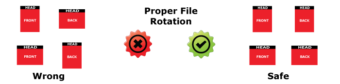
Proper File Rotation - When printing front and back, files are layed out head to head (Top to Top). Files for the front and back sides must be submitted either vertically or horizontally to insure that they get printed the way you would like them to be
RICH BLACK vs. BLACK
Rich Black consists of 30% Cyan, 30% Magenta, 30% Yellow, 100% Black.
Black consists of 100% Black, 0% Cyan, 0% Magenta, 0% Yellow.
For regular body text, avoid using Rich Black - use 100% Black. Using Rich Black on text, especially small text, may cause text to look blurry.
A rich black on large solid black areas is recommended to prevent color looking gray.

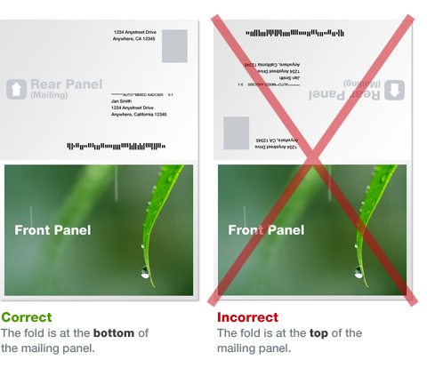
FOLDED MAILERS
For folded mailers your artwork MUST be set up like this with the opening edge above the address and indicia area.